
This page includes samples of the work that I have completed in Adobe InDesign throughout the semester. The headings denote the project number, the text explains my reasoning for designing the works in the way that I did, and the image on the right of the text is a thumbnail of the project I created. To see a larger version of the project, you can simply click the thumbnail.
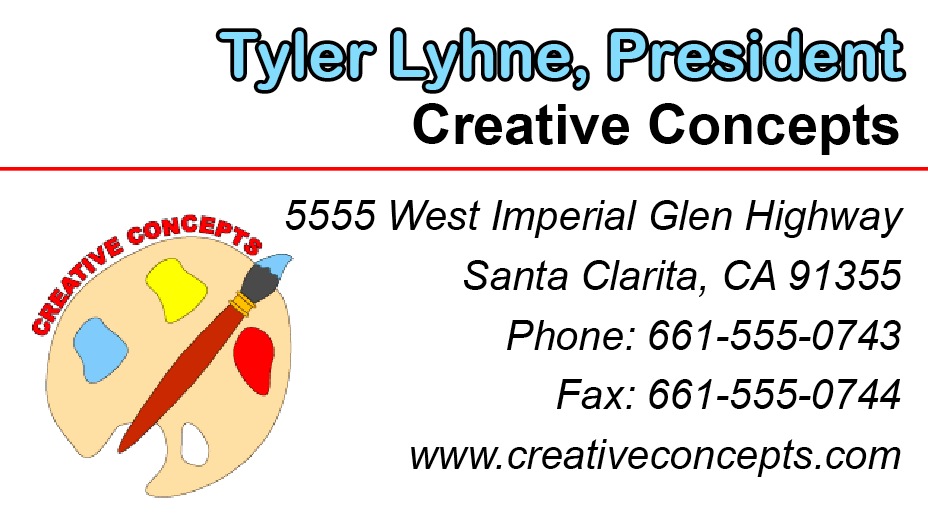
I designed this business card to have very vlean lines because I wanted the focuse to be on the person on the card rather than on fancy writing or an over-the-top design. I simply bolded and colored the client's name at the top because the most attention should be focused on who is being advertised. I also bolded the name of the company, which is of secondary importance. And to connect the colors in the heading with the colors in the logo, I used a horizontal line to draw the audience's eye through the content of the business card. I designed the logo myself in InDesign. I drew an art palette and a paintbrush to communicate that this was an artistic company. I chose bold basic colors that would be easy to match on company materials and would also pop off of the white paper.
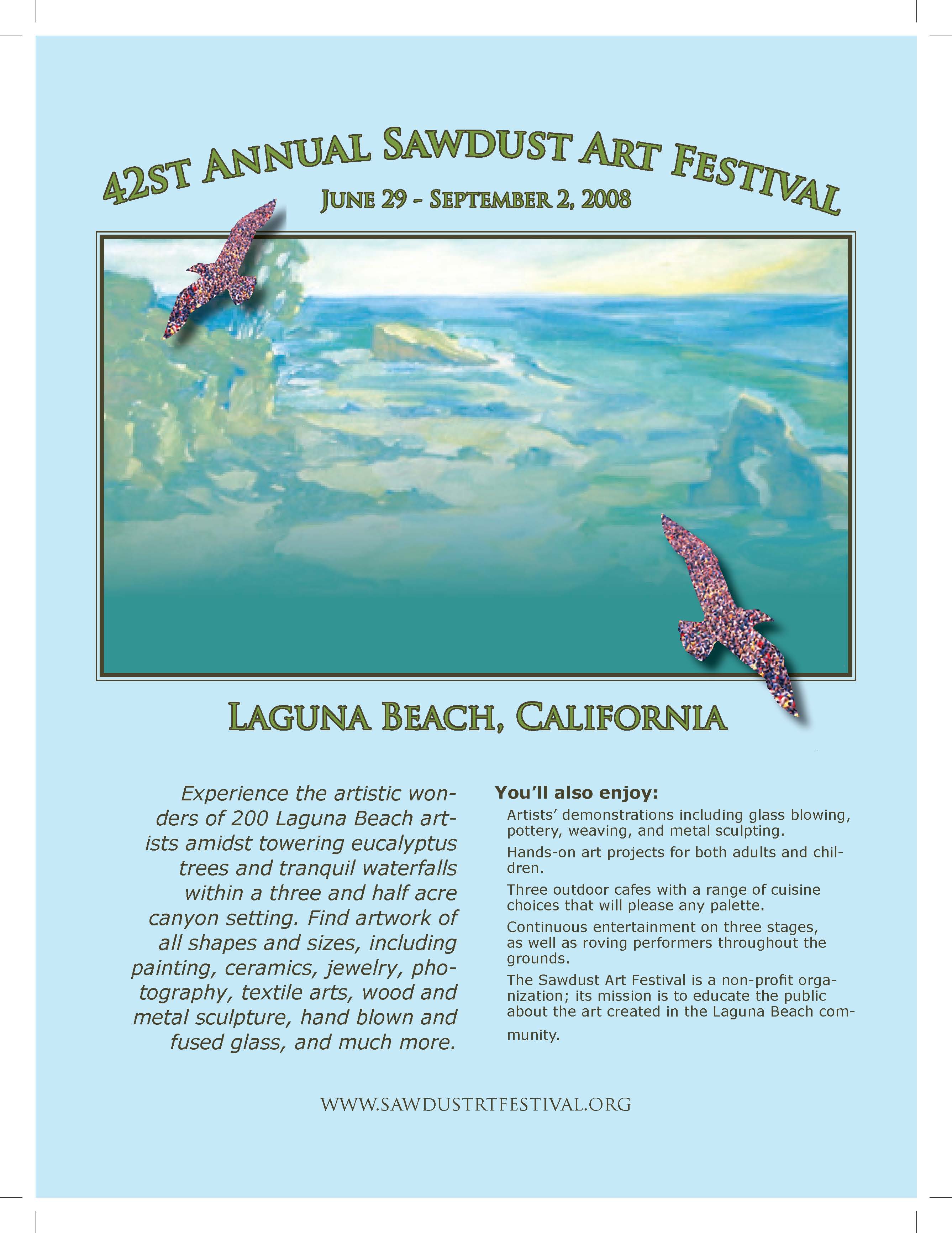
For the Sawdust Magazine Advertisement,I wanted to showcase a piece of artwork from the Sawdust Festival, so I found a painting from the website and placed it in the middle of the page. I chose to put a border around the picture because I felt like it really helped the picture to stand out on the page, and it gave it a very elegant look. It also helped to connect the painting to the words surrounding it, which are of a similar color. I then used this painting to choose a complementary color scheme. I chose a light, pastel blue for the background, so as not to take away from the picture and make the advertisement very easy to look at and to read.
I also used a light green for the header text because the complementary color draws the audience's eye from the painting, with its very similar border, to the words. I used a darker color and a simple font for the description of what would be taking place at the festival, so the audience could skim it with ease. I also didn't want a big block of text to discourage people from looking at the advertisement, so I tried to downplay it a little bit but not so much that no one would find it. I just wanted the emphasis to be on the painting and its location. I chose to place cutouts of birds filled with a crowd of people to match the them of the advertisement and emphasize what a popular event this would be. I put drop shadows on the birds because it gave the advertisement a 3D effect that helped the birds pop off the page and helped to draw in the audience's eye.
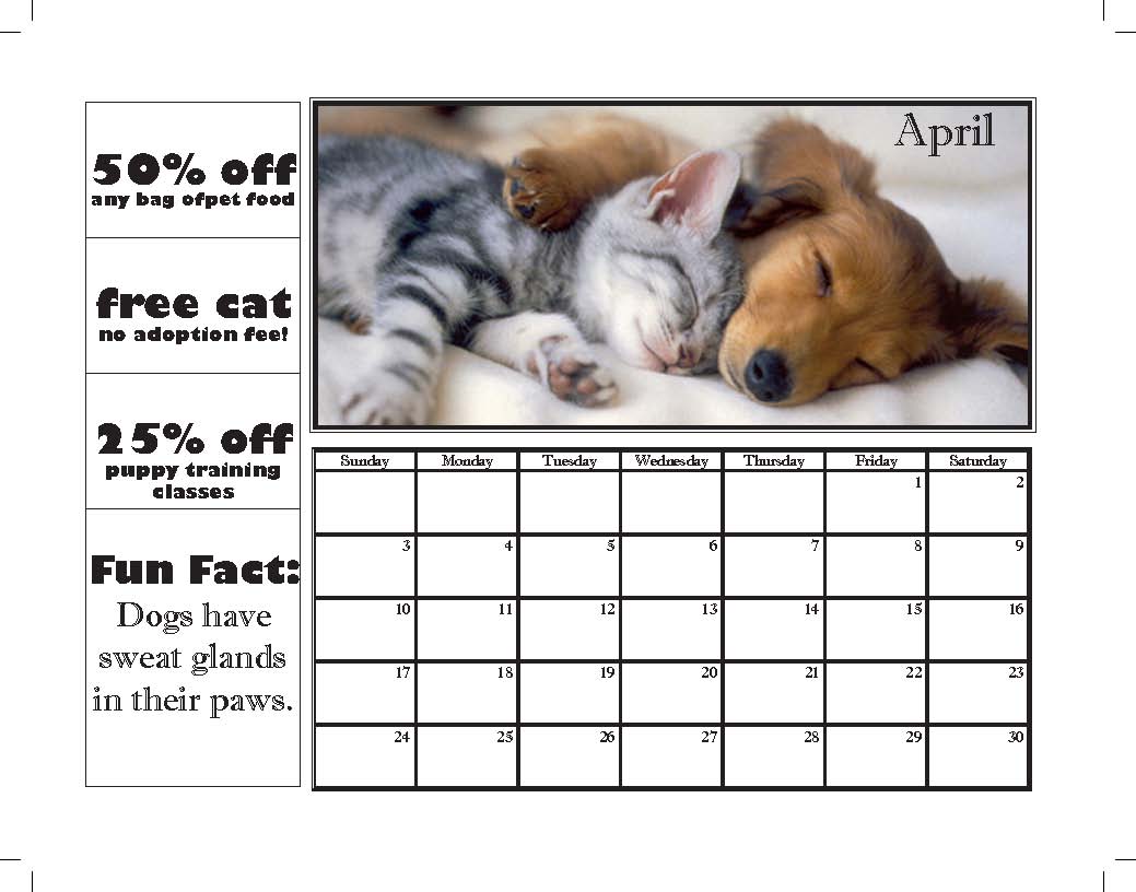
For the Humane Society calendar, I wanted to make sure that I included cats and dogs since these are the most commonly adopted pets, but I also wanted to dedicate as much space as possible to animals that were not cats and dogs to remind those who received the calendars that there are many other kinds of animals that are in need of a good home. To do this, I found one picture with both a cat and a dog so that I could have more space for the other kinds of animals. When choosing pictures for the calendar pages, I looked for images where the animal was the main focus and the image was an appropriate size so that the image did not get distorted when placing it on the page.
When choosing my fonts, I wanted the coupons to be very fun since adopting a pet is supposed to be a fun experience. I wanted the font for the calendar to be a little more elegant though since it would probably be used throughout the year and not just when initially purchasing pet supplies -like the coupons. I chose to lay the page out in landscape mode so that the coupons and fun facts could easily be removed without leaving an awkwardly shaped calendar; instead, it leaves a neat, square calendar.
I chose to write the actual text of each fun fact in the same font I used for the calendar because I thought it was more easily readable than the coupon font. I chose a fun fact for each page that related to the animal on that page; doing this would ensure that the calendar owner received a variety of fun facts and not just 12 fun facts about dogs and cats. I chose to place the name of the month somewhere on each picture in either black or white - whichever stood out the best and made the title most legible; I also thought this added a more finished, professional look to the calendar than putting the month name above the picture would have done.
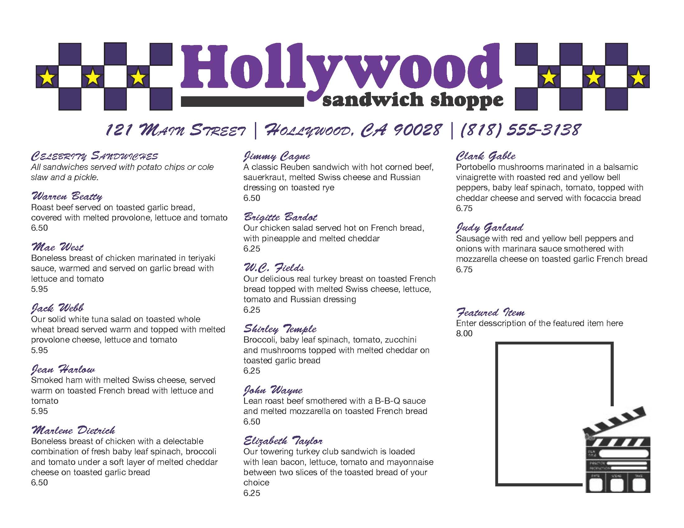
I chose to use the purple from the logo and the black as the color scheme for the menu. Since the client mentioned printing in black and white if possible, I tried to keep the design very simplistic. In the event that the company did print in color, they would notice that I made all of the squares and menu items the company's purple. However, if they print in black and white, since it's a pretty dark purple, it wouldn't compromise the legibility of the document. I chose to do the menu items in a more fun, whimsical font, but I wanted the descriptions and prices to be very clear and easy to read, so I stuck with Helvetica. I used the character styles to maintain these throughout the menu.
I did not design the menu to be folded; it is designed to lay flat on a table of to be place in one of those stands. It's supposed to be quick and easy, no folding necessary. The front is all the sandwiches and the special feature item, which includes placeholder text and a placeholder frame for the picture requested. I also included a little Hollywood clip art to enhance the theme and add a little bit more fun to the front. I added the stars inside the middle row of boxes for the same reason. I used these two things because both would maintain their quality if printed in black and white.
The back contains the salads and desserts and room for two more pictures and captions. I carried the color scheme and squares over from the front in order to unify the front and back of the menu. I also added the logo and information so that it would be available regardless of which side you were viewing.